Using Data Visualisation to Find Insights in Data
Visualization is critical to data analysis. It provides a front line of attack, revealing intricate structure in data that cannot be absorbed in any other way. We discover unimagined effects, and we challenge imagined ones.
(quote by William S. Cleveland in the preface of his book 'Visualising data')
Everything is visualised
Q: When do you need to visualise a dataset to explore it and find a story? When don’t you need to?
Data by itself, consisting of bits and bytes stored in a file on a computer hard-drive, is invisible. In order to be able to see and make any sense of data, we need to visualise it. In this chapter I'm going to use a broader understanding of the term visualising, that includes even pure textual representations of data. For instance, just loading a dataset into a spreadsheet software can be considered as data visualisation. The invisible data suddenly turns into a visible 'picture' on our screen. Thus, the questions should not be whether journalists need to visualise data or not, but which kind of visualisation may be the most useful in which situation. In other words: when does it makes sense to go beyond the table visualisation.
The short answer is: almost always. Tables alone are definitely not sufficient to give us some kind of overview or big picture of a dataset. Also tables alone don't allow us to immediately identify patterns within the data. The most common example here are geographical patterns which can only be observed after visualizing data on a map. But there are also other kinds of patterns which we will see later in this chapter.
How can visualisation help us to discover a story in a dataset?
How do you go about discovering a story? What tools do you use? What “protocol” do you follow? What clues do you follow, what do you pay attention to? (lessons, tips, advice).
Well, discovering a story through visualisation is a rather big goal to start with. In fact, there is no set of rules or "protocol" that will guarantee us to discover a story. Instead, I think it makes more sense to seek for smaller chunks of knowledge, from now on called insights.
Every new visualisation is likely to give us some insights into our data. Some of those insights might be already known (but maybe not proven yet) while other insights might be completely new or even surprising to us. While some of those new insights might actually mean the beginning of a story, others could just be the result of errors in the data.
In order to make the finding of insights in data more effective, I find the following process very helpful:
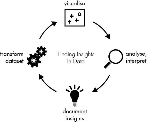
Each of these steps will be discussed further in this section.
Visualise data
Visualising data is the central point of this process. Each visualisation provides a unique perspective on the dataset.
Some of the most important types of visualisations:
- table - displaying the raw numbers
- charts - (http://www.flickr.com/photos/amit-agarwal/3196386402/sizes/l/)
- maps - displaying geographical context
graphs - displaying relations in networks
Todo:
- explain the vis types in more detail (provide examples)
- maybe mention a few tools which can be used for data vis.
Analyse and interpret what you see
Once you have visualized your data, the next crucial step is to learn something from the picture you created. Of course, you can't learn nothing from looking at a visualization. But you should take yourself some time to really get into what you see. We need to ask us the following questions:
- What can I see in this image? Are there any patterns?
- What does this mean in the context of the data?
Sometimes you might end up with visualization that, despite of eventual beauty, seem to tell you nothing of value about your data. But, again, for this process it's important that you force yourself to identify some new insights.
Document your insights and next steps
If you think of this process as a journey through the dataset, the documentation is your travel diary. It will tell you where you have traveled to, what you have seen there and how you made your decisions for your next steps. You can even start your documentation before taking the first look at the data.
In most cases when we start to work with a previously unseen dataset we are already filled up with expectations and assumptions about the data. Obviously, there is some kind of reason why we are interested that dataset. It's a good idea to start the documentation by writing down these initial thoughts. This helps us to identify our bias and reduces the risk of mis-interpretation of the data by just finding what we actually wanted to find.
I really think that the documentation is the most important step of the process; and it is also the one we're most likely to tend to skip. As you will see in the following sample session, the described process involves a lot of plotting and data wrangling. Looking at a set of 15 charts you created might be very confusing, especially after some time has passed. In fact, those charts are only valuable (to you or any other person you want to communicate your findings) if presented in the context in which they have been created.
Therefor you should take the time to document a few things while you are going to this process. The goal is not to write epic stories, but to keep notes about some really important questions:
- Why have I created this chart?
- What have I done to the data to create it?
- What insights have I found from this chart?
You can choose whatever format is convenient to you. Every tool that allows you to insert a sequence of texts and images (like PowerPoint or Word does) is perfect.
Transform data
Naturally, with your new insights gathered from the last visualization you might have an idea of what you want to see next. You might have found some interesting pattern in the dataset which you now want to inspect in more detail.
Possible transformations are:
- zoom into a. (e.g. limit to a certain time span)
- filter
- aggregate
- outlier removal
Now the time has come where we can really move on. The good news is that we've already solved the hardest question of moving on, that is: in which direction should be move on? Remember that insight you got from the last visualization? The one you've written down in you story documentation? The next step is trying to remove this insight from our data. The theory behind this is that every insight in your data might prevent us from seeing some other insights. Removing something we already know is no problem, as long as we're keeping everything for our records. And this is what I call the transform step.
Which tools to use
Every data visualization tool available is good at something. However, here are a few requirements for choosing the right tools:
- Visualisation and data wrangling should be easy and cheap. If changing parameters of the visualizations takes you hours, you won't experiment that much. That doesn't necessarily mean that you don't need to learn how to use the tool. But once you learned it, it should be really efficient.
- For some reasons it makes much sense to choose a tool that covers both the data wrangling and the data visualisation issues. Separating the tasks in different tools means that you have to import and export your data very often.
The sample visualizations in the next section were created using the R, which is kind of the swiss army knife of scientific data visualisation.
Example session: making sense of US election contribution data
Examples of how to explore a dataset with a visualisation tool with a step by step description of the “protocol” followed to find the story.
Let us have look at the US Presidential Campaign Finance database which contains about 450,000 contributions to US Presidential candidates. The CSV file is 60 megabytes and way to large to handle it easily in Excel.
In the first step I will explicitly write down my initial assumptions on the FEC contributions dataset:
- Obama get's the most contributions (since he's the president and has the highest popularity)
- The number of donations increases as the time moves closer to election date.
- Obama gets more small donations than republican candidates.
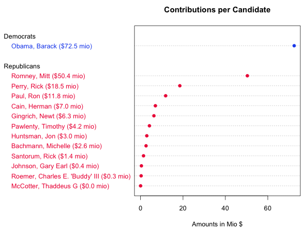
To answer the first question we need to transform the data. Instead of each single contributions we need to sum the total amounts contributed to each candidate. After visualising the results in a sorted table we can confirm our assumption that Obama would raise the most money.
| Candidate | Amount ($) |
|---|---|
| Obama, Barack | 72,453,620.39 |
| Romney, Mitt | 50,372,334.87 |
| Perry, Rick | 18,529,490.47 |
| Paul, Ron | 11,844,361.96 |
| Cain, Herman | 7,010,445.99 |
| Gingrich, Newt | 6,311,193.03 |
| Pawlenty, Timothy | 4,202,769.03 |
| Huntsman, Jon | 2,955,726.98 |
| Bachmann, Michelle | 2,607,916.06 |
| Santorum, Rick | 1,413,552.45 |
| Johnson, Gary Earl | 413,276.89 |
| Roemer, Charles E. 'Buddy' III | 291,218.80 |
| McCotter, Thaddeus G | 37,030.00 |
But despite of showing the minimum and maximum amounts and the order the table does not tell very much about the underlying patterns in candidate ranking. Here is another view on the data, a chart type that is called dot chart in which we can see everything that is shown in the table plus the patterns within the field. For instance, the dot chart allows us to immediately compare the distance between Obama and Romney and Romney and Perry without needing to subtract values. (Footnote: The shown dot chart was created using R. You can find links to the source codes at the end of this chapter).
Now, let us proceed with a bigger picture of the dataset. As a first step I visualised all contributed amounts over time in a simple plot. We can see that almost all donations are very very small compared to three really big outliers. Further investigation returns that these huge contribution are coming from the "Obama Victory Fund 2012" (also known as Super PAC) and were made on June 29th ($450k), September 29th ($1.5mio) and December 30th ($1.9mio).
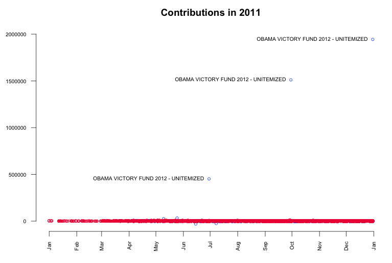
While the contributions by Super PACs alone is undoubtedly the biggest story in the data, it might be also interesting to look beyond it. The point now is that these big contributions disturb our view on the smaller contributions coming from individuals, so we're going to remove them from the data. This transform is commonly known as outlier removal. After visualizing again, we can see that most of the donations are within the range of $10k and -$5k.
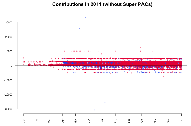
According to the contribution limits placed by the FECA individuals are not allowed to donate more than $2500 to each candidate. As we see in the plot, there are numerous donations made above that limit. In particular two big contributions in May attract our attention. It seems that they are 'mirrored' in negative amounts (refunds) June and July. Further investigation in the data reveals the following transactions:
- On May 10 Stephen James Davis, San Francisco, employed at Banneker Partners (attorney), has donated $25,800 to Obama.
- On May 25 Cynthia Murphy, Little Rock, employed at the Murphy Group (public relations), has donated $33,300 to Obama.
- On June 15 the amount of $30,800 was refunded to Cynthia Murphy, which reduced the donated amount to $2500.
- On July 8 the amount $25,800 was refunded to Stephen James Davis, which reduced the donated amount to $0.
What's interesting about these numbers? The $30,800 refunded to Cynthia Murphy equals the maximum amount individuals may give to national party committees per year. Maybe she just wanted to combine both donations in one transaction which was rejected. The $25,800 refunded to Stephen James Davis possibly equals the $30,800 minus $5000 (the contribution limit to any other political committee).
Another interesting finding in the last plot is a horizontal line pattern for contributions to Republican candidates at $5000 and -$2500. To see them in more detail, I visualised just the Republican donations. The resulting graphic is kind of the perfect example for patterns in data that would be invisible without data visualisation.
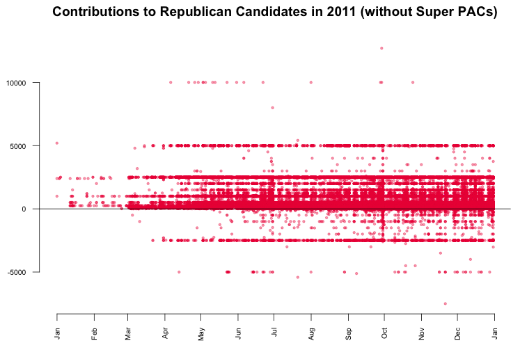
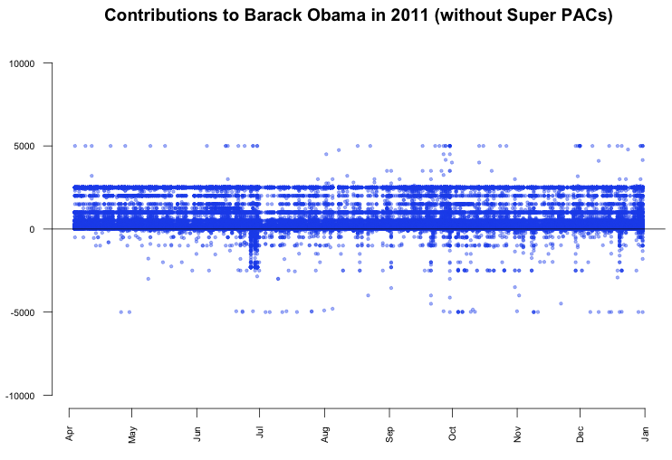
What we can see is that there are many $5000 donations to Republican candidates. In fact, a look up in the data returns that these are 1243 donations, which is only 0.3% of the total number of donations, but since those donations are evenly spread across time, the line appears. The interesting thing about the line is that donations by individuals were limited to $2500. Consequently, every dollar above that limited was refunded to the donors, which results in the second line pattern at -$2500. In contrast, the contributions to Barack Obama don't show a similar pattern.
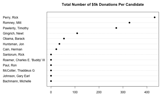
So, it might be interesting to find out why thousands of Republican donors did not notice the donation limit for individuals. To further analyze this topic, we can have a look at the total number of $5k donations per candidate.
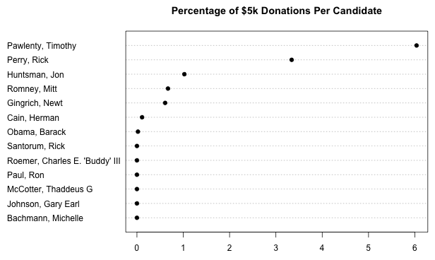
Of course, this is a rather distorted view since it does not consider the total amounts of donations received by each candidate. The next plot shows the percentage of $5k donations per candidate.
What learn from this
Often, such a visual analysis of a new dataset feels like an exciting journey to an unknown country. You start as a foreigner with just the data and your assumptions, but with every step you make, with every chart you render, you get new insights about the topic. Based on those insights you make decisions for your next steps and what issues are worth further investigation. As you might have seen in this chapter, this process of visualizing, analyzing and transformation of data could be repeated nearly infinitely.
Source codes for the generated graphics
All of the charts shown in this chapter were created using the wonderful and powerful software R. Created mainly as a scientific visualization tool, it is hard to find any visualization or data wrangling technique that is not already built into R. For those who are interested in how to visualise and wrangle data using R, here's the source code of the charts generated in this chapter. Also, there is a wide range of books and tutorials available.
- dotchart: contributions per candidate
- plot: all contributions over time
- plot: contributions by authorized committees
Further Reading
The author of this chapter has been influenced by the book Visualizing Data by William S. Cleveland, published in 1993.